Responsive Website

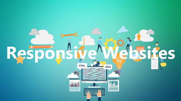
A few decades back, laptops were the most compact form of computers, but not anymore. In scenarios a smartphone or a tablet that you hold in your palm has more features than a standard laptop. Thanks to the faster silicon chip technology, compact IC and faster processor, they are applicable for anything from gaming to internet surfing. Infact, recent stats say that more and more people are now preferring smartphones and tablets to access the internet instead of a laptop or desktop.  

The stats at Statista reveal that almost 4.28 billion people will have used smartphones to surf the internet in the year 2020. That’s almost 90% of the global intent population and a lot of target audience for your site who will never use it, if you don’t focus on responsiveness. And we would love to help you with this part.

At Scorpius, we have a team who are well-versed with the increasing demand of responsive websites and know every tip and trick for turning your static web to one. We have spent years and years sharpening our coding and designing skills for this purpose and are always happy to help website owners like you. 

Responsive

Why Responsive Websites?

The main reason for creating a responsive website is to make it adaptable for smartphones, but that is just one of its many features. There are many positive impacts of developing responsive websites. For instance, the responsive website will offer better resolution, improved user experience and many more including the following.

 Improved SEO

Google being the largest search engine has always focussed on user experience before anything else. It prioritises responsive websites over the static ones. It means lets us create a responsive website will help you to get better SEO ranking, which in turn will improve your online authority.

Acquire Traffic 

If you have a static website, any users surfing intent through smartphone or tablet wont be able to use it properly. And considering the number of internet users using smartphones, it’s no brainer that you will lose a huge part of your potential audience.  

Moreover, since responsiveness affects the SEO ranking, it will make a difference in your position on the search page. The search engines will place any static site to the lower position. Thus both its authority and chances of getting click through will decrease.

Faster Loading For Better Conversion Rate

It takes a user just a few seconds to leave a site that does not load fast or looks unappealing. Thanks to the proportion based code of the responsive website, you don’t have to face this problem. Each element of these websites are optimized to open on all devices and use a fluid grid. This grid facilitates in decreasing the website loading time to a great extent. 

The speed along with flexible UI also help to increase the conversion rates. It ensures you don’t lose potential traffic coming using a smartphone to access your website.  

Word Of Mouth Marketing

Amongst all the marketing methods, the word of mouth marketing is believed to be the strongest. It’s because here you dont market you site yourself, but let you loyal customers do it for you. The marketing is free, doesn’t need any tool and involves personal touch. So, it almost every time yields great benefits for businesses. 

However, the marketing technique will fail terribly if you don’t have a responsive website. Stats reveals that almost 57% of internet users confess, they would never recommend a website whose design is not mobile friendly. And more than 38% will leave your site if its layout is not attractive on a smartphone.


Why Choose Us?

When it comes to creating Responsive websites, Scorpius is the best pick. We have a team of colorful and light minded people with great creativity and skills, that they like to put-in for developing these sites. We can help you with not just developing a responsive site, but also enhance its appearance, user experience and a lot more. There’s a long list of benefits of doing business with us.

Quick Response

At Scorpius, we take your time very seriously. Our team is always ready to work and answer your queries at every time. Once you contact us, we will respond back with every detail you asked within no time. Moreover, once we are in business with you, our members will adjust their schedule to suit your timeline. We won’t make you wait for our reply right from the first contact to the successful delivery of the project

Full Support

Unlike our competitor we dont believe that a project ends with successful delivery. It goes far beyond and we like it that way. So, even after we have successfully delivered the project, our team will be actively available for communication. We will readily help you with any problem you might face. You can also contact us for regular maintenance and optimization of your website. 

Right Time Work

At Scorpius we believe that the time that has gone is the time you have lost. So we try to minimize delays in all our projects. Whether you send a website for optimization or ask as to create a new one, we will create a plan that will stick with your particular needs. Our team is always ready to go a step further and put in some extra effort to meet the deadline. 

Edits Existing Or creating New

Custom Website Design

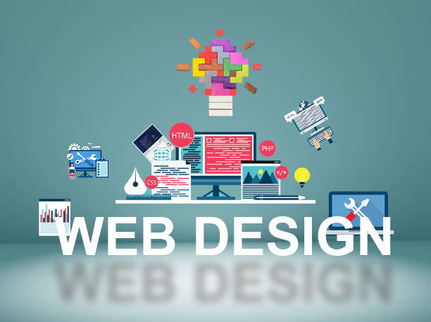
Custom Website Design is one of the essential things that can help to boost your marketing efforts and promote your business. So, if you are looking for a website design company, then you can count on us. 


We at Scorpius Technology have a professional team to provide you a professionally designed website. Our staff regularly works with companies of all sizes and industries to provide them with the effective layout of their websites. They take care of your site’s style, the number of clicks, and other things to keep your potential customers.


After hiring us, you no longer need to be stressed about your business’s growth. Our wide range of services is available for both small and large businesses. 

Why Partner with us?

We at Scorpius believe in quality work with the least hassle. Our team strives to provide a highly interactive website without much research or work from your side. And that’s not all we do, we are a great choice for your business due to tonnes of reasons including the following.


We Create Experience

When working on a website, our team doesn’t just work on the looks of the website; we work for its overall user experience. We design the website with proper breadcrumbs, easy navigation, and of course, a non-distracting UI. The pages will have your brand colors and will include logos but will never create clutter or a word-looking contrast.


Wide Choices

When working with us, the one thing that you can rest assured of is creativity. Our team consists of some really creative and out-of-the-box thinking members. You can trust them to come up with ideas that are both unique and attractive. We also keep on learning the global changes, SEO updates, and latest design trends to supplement our knowledge for that particular part.

Highly Visual

There’s a popular saying, “a picture speaks a thousand words.” We couldn’t agree more. In our years of working in Web development and designing work, our team has learned that visuals attract more users than any text-based content. They are easy to understand, need minimal time and look pleasant to the eyes. And we are sure you, too, know that visuals are an inseparable part of your website. That’s why we have employed some great graphics designers in our custom website development team. We can provide you with images, graphics, infographics, and, when needed, logos for your site. Plus, our work is not limited to just one particular design application. We are fluent in Canva, Photoshop, illustrator, and many more. 

Responsive Design

Did you know that nearly 54.8% of global traffic comes from mobile devices? It’s because smartphones and tablets are much more flexible than any desktop and laptop. They are light, faster and you carry them with you all the time. Considering these numbers in mind, there’s no way you can even consider designing a website that works just on one particular screen size. And that’s why each of the custom websites we make is highly responsive. We optimize it to run on every device and screen size with the same speed and fluency. Once done, we will test each page in multiple resolutions to ensure the speed and optimize it when needed. In short, no matter which device you use, the website will not take more than a few seconds to open. 

Small Teams

While a big agency with a large number of developers seems like a good pick, we like to stick with small teams. It helps to keep the process fluent and eliminate any risk of communicational gaps. Not to mention, it keeps the team agile. Our teams consist of a project manager who oversees the work, a lead designer, a coding guru, and a junior web designer who works alongside a web design expert to create the perfect custom design for you. There’s also a quality analyst who will test the website and its design on every step to ensure it’s secure and high-performance. The expert is also well versed with bug removal, so the final website does run into a problem after it’s live.

Dedicated Writers

The work of designing a website does not end with setting the UI. You will also need quality content to convert your message and get some attention. The content is also important for retaining users once they reach your website, and we can help you with it. Our firm has a dedicated writing team well-versed in SEO and high-quality content creation. Our writer can help you to glorify each section of your page with content that is simple, attractive, and highly SEO optimized. It will use enacting words to bring out the specialty of your brands and explain every single thing about it to anyone who reaches your website. We also use paid tools including Semrush, Grammarly, and Copyscape to check every piece for plagiarism and readability. 


Software And Tools We Use

As we said before, Our teams are not limited to just one or two web designing and content management tools. We are experienced with almost every recognized and adopted application, including the following:

Dream Weaver

The adobe owned and operated DreamWeaver is a flexible coding and website management application. We use it to create and edit the basic backend codes of the website. Its simplified code engine helps us to keep work simple, fast, and fluent. And its dynamic screen helps us to ensure the adaptability of the website. 

Notepad++ and Visual Studio

While we prefer Dreamweaver for writing and checking our codes, we do deviate from it when needed. Our developer has experience working with almost every major language, including PHP, CSS, JavaScript, Json, XML, HTML, and more. So we are comfortable working with NotePad++ and Visual Studio. In fact, we prefer these two for large websites due to their faster compiling feature. 

Illustrator And Photoshop

Needless to say, Photoshop and illustrators are leading software for creating both web design and high-end graphics. We use them to create vector and raster arts, including animation, for your website. When needed, you can also ask us to make a custom logo on one of these. And if these two don’t seem fit for your needs, don’t worry; we are ready to use any related application, including CorelDraw, to meet your standards. 

The small set of development and graphic applications you just read are barely the top application from our list. Although, our team is flexible in this aspect and very adaptable with new applications. So, just feel free to discuss the tool, language, or CMS that you prefer. We will adjust to your needs and create a website that will make you proud of being a website owner.  

Top 9 Web Design Trends For 2022

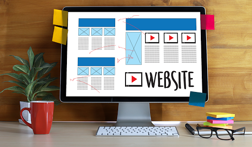
Talking about web design trends for 2019 is an opportunity we could not miss. It does not matter if you are starting your business or if you want to give a new twist to your website, what we learned something from 2018 is that the best investment you can make for your company is to invest in your website.

The main web design trends in 2019 will see how aesthetics and technology come together like never before. 2019 is almost the last chapter of a decade. And keep in mind that the Internet has grown and changed a lot in the last ten years.

For years, design trends have driven unbridled creativity, the abandonment of grids and traditional archival photographs for vibrant illustrations, bold colors and asymmetrical designs.

Discover 9 of web design trends in 2019

In the last year, advances in technology have been seen that help to better connect with users, new styles that are overcoming limits and a greater focus on documentation and accessibility guidelines to make the sites a more coherent and accessible to all. With so many changes around it’s time to put the brakes on and look at web design trends for 2019.

1. Reinventing the Headers of the Websites

Most headers have a large image that covers most of the home and a short explanatory headline. During the last years, there have been no changes in this area of the web.

By 2019, some sites have already begun to experience changes in their headers. As they are leaving the traditional designs and introduced new features in this section of the website.

For example, some websites don’t add image and has a blank space area with a simple header at the bottom of the header. They are two examples of what you begin to see that includes changing the present content, using something different from a full-width image and treating this area as the main area to capture the viewer’s attention.

2. Natural and Organic Forms

An organic form is any form that is irregular and uneven, imperfect. Although web pages are usually configured for systematic grids, designers are turning to natural forms. With soft lines, drawn “by hand”.

Geometric structures such as squares, rectangles and triangles with their sharp corners create a feeling of stability. However, web design trends for 2019 are more concerned with giving a sense of accessibility and comfort.

Organic forms are naturally imperfect and asymmetrical and can provide depth to a web design. With their unusual appearance, they can be used to capture a user’s attention and add a personal touch to a website.

3. The Serifs Also Serve for Digital

If you move in the world of design, you have surely heard that serifs are for printing and that dry-type fonts are for the screen. While sans, with its clean legibility, still has the ideal style of the longer texts on the websites, more and more brands are using SERIFS. Especially in headings and labels.

The reason? The letters in serif are perfect to put the point of attention in a specific phrase. Within an attractive and current design. And even though the serifs are often associated with the past, they have a lot of body and are more adaptable than you think.

4. Broken Grid and Asymmetrical Designs

The concept of the grid in terms of design is an imaginary plane with horizontal and vertical lines, which is used to help design elements on the page or screen. It is a way of aligning what is being worked on.

When you have a broken grid, it means that the elements that form the design are not at a glance perfectly neat. Which makes the grid not perfectly aligned.

Some websites show a broken grid layout on most of its website. These kinds of designs that break the rules have always existed as a form of creativity. A way to stand out from the crowd. However, nowadays it starts to be part of the Web design trends for 2019.

5. Overlapping Design Elements

This is a trend related to asymmetric designs. When the grid breaks, the elements overlap each other. This allows you to develop a design on specific types of content on a website.

Users are accustomed to having each element of the web have its own space. And that they are also at a specific distance from the other elements that occupy the same website. They do not usually touch each other.

Some website presents overlapping elements as the main aesthetics of design throughout the site. In addition, subtle animations are also added that make the website feel three-dimensional.

The tendency of elements superimposed on a page can help to improve the general aesthetics of the site. It can be quite difficult to execute on mobile websites, since overlapping elements, if not done well, can cause confusion and frustration in users.

Especially when the elements overlap incorrectly. Therefore, you have to be very sure of doing it well. As you experiment more with a three-dimensional website, this trend is on the rise.

6. More Video Content

This web design trend is not new, but it is still booming in 2019. The video not only diversifies the page but it is aimed at users who do not have time to scan a large amount of text.

What is new is that video content is prioritized above all, giving it a full protagonism. This has led websites to prioritize the videos production so that they can offer content in the most efficient and shareable way.

7. Monochromatic and Absence of Color

Color is one of the most important elements in a website. Cultivate an environment, unify a brand and guide users through an interface by creating visual reference points.

What happens if you limit yourself to a single color or even bet on black and white? If done well, that type of design restriction can help improve a design.

Limiting yourself to a single color can help consolidate your brand.

Since most websites have two to five colors that are used everywhere, using only one color could make you stand out and make it more memorable for a user.

Going one step further and eliminate the color completely is definitely an option if you are looking to give a total turn to your design. Neutral colors are one of the web design trends in 2019.

8. Betting on Minimalism

Perhaps it is one of the most classic and timeless web design trends; minimalism is often the aesthetic of choice. The fewer elements and content on a website, the better. If a website is designed in the right way, it will show the user exactly what they are looking for.

Minimalism will continue to dominate web design trends in 2019. The animations and effects that make the scroll more attractive will give web pages the freedom to space their content. And, therefore, will result in more blank spaces, contrasts and clear typographies, without too many distracting elements.

9. More than Enough White Space

The effective use of white space is a design tool used by designers for decades. However, what is not so common is the amount of white space used. Or, even make the blank space the protagonist of the web.

Some websites use additional blank spaces in the header of the site. At first glance it looks like a design error. However, it is a strategy. The use of additional blanks used is intended to give a break to the information.

Adding additional blank space is part of the aesthetics of the design. By choosing to add a blank space in areas that do not necessarily need it, it becomes an important part of the design. The websites use many blank spaces to make a statement or to make it the focal point of the website.

Which of these web design trends for 2019 are you going to apply to your strategy this year? At Scorpius Technology we can help you to completely turn around your digital marketing campaign and challenge all limits.